Take A Closer Look At (and Teach) W.E.B. Du Bois’s Afrofuturist Data Visualizations from 1900
I moved to Philadelphia a year and a half ago and purchased a few books to help me learn about my new city as I settled in. One of them, The Philadelphia Negro: A Social Study, was written by the sociologist, activist, and NAACP co-founder W.E.B. Du Bois. (Bear with me: you probably know this all already but as a Brit, I have almost no background in US history and have been teaching myself gradually.) The book was researched between 1896-7 while Du Bois was an Assistant in Sociology at the University of Pennsylvania, where he was employed to investigate the seventh ward of the city of Philadelphia. Published in 1899, the book is the first closely observed, systematic study of black Americans in the US, and was radical not only for this fact but also for its author’s adamant rejection of inherent racial difference, focusing instead on factors such as poverty and access to resources like education and healthcare.
I devoured it.
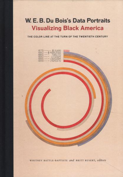
Flash forward one year. While researching examples of data visualization for the current modern and contemporary design course I’m co-teaching at that same university at which DuBois once worked, I came across a newly-published book that had me gripped as I flipped its pages: W.E.B. Du Bois’s Data Portraits Visualizing Black America: The Color Line at the Turn of the Twentieth Century (Princeton Architectural Press, 2018). I bought it, of course. And I devoured it too. And then I decided to teach from it.
***
In what the book’s editors Whitney Battle-Baptiste and Brit Rusert describe as an “investment in a truly public sociology,” in 1900, as a professor of sociology and history at Atlanta University in Georgia, Du Bois collaborated with a wide range of colleagues, students, and alumni to produce approximately sixty data visualizations. These designs were shown as part of an umbrella exhibition, the Exposition des Negres d’Amerique (The American Negro Exhibit), at the 1900 Paris Exposition Universelle (which had over 50 million visitors and 120 participating countries during its seven month run). Using Census data, as well as reports from government bodies like the US Department of Labor, Du Bois shifted his focus from Philadelphia to Georgia to create two unique series of data visualizations: The Georgia Negro: A Social Study and A Series of Statistical Charts Illustrating the Conditions of the Descendants of Former Slaves Now In Residence in the United States of America.
These boldly colored graphs and charts interrogated everything from literacy to population distribution to employment, and a striking lead image for the Georgia study represented the “color line”–the transatlantic slave trade route–further theorized by Du Bois in his 1903 The Souls of Black Folk (where he noted that “the problem of the twentieth century is the problem of the color-line”). As Battle-Baptiste and Rusert attest, “while a broader American culture was not ready to recognize the existence of a school of black sociologists in the US South, Du Bois turned to a visual medium–and the proto-modernist aesthetics of turn-of-the-century data visualization–to gain the attention of an international audience.”
Their words are striking in the current context of movements like Black Lives Matter and contemporary tools like social media. It’s worth noting that while the larger American Negro Exhibition (which featured a much wider range of objects, images, and texts “meant to educate patrons about the forms of education and uplift occurring at black institutions and and in African American communities across the US”) has been thoroughly studied, their book is the first to bring together all the data visualizations reproduced in full color. It also includes significant scholarly reflections from Mabel O. Wilson, Aldon Morris, and Silas Munro. Battle-Baptiste and Rusert highlight that this work is a part of (design) history that should be seen, known, and more widely accessible–one of the goals of their publication.
***
If you’ve ever taken a design history course of any kind, especially one focusing on modern and contemporary design, you’ll know that the international “Great Exhibitions” like the one in 1900 where Du Bois’s work was shown, are a central focus. The first ever was held from May 1 to October 15, 1851, in the Crystal Palace erected on the outskirts of London by Joseph Paxton with the support of Prince Albert and civil servant Henry Cole. In an average design history textbook, the canon teaches us that these large events–the Exposition Universelles of 1855, 1867, and 1889 in Paris and the Centennial Exhibition in Philadelphia of 1876, to name but a few–attracted thousands of exhibitors from across the globe and many millions of visitors.
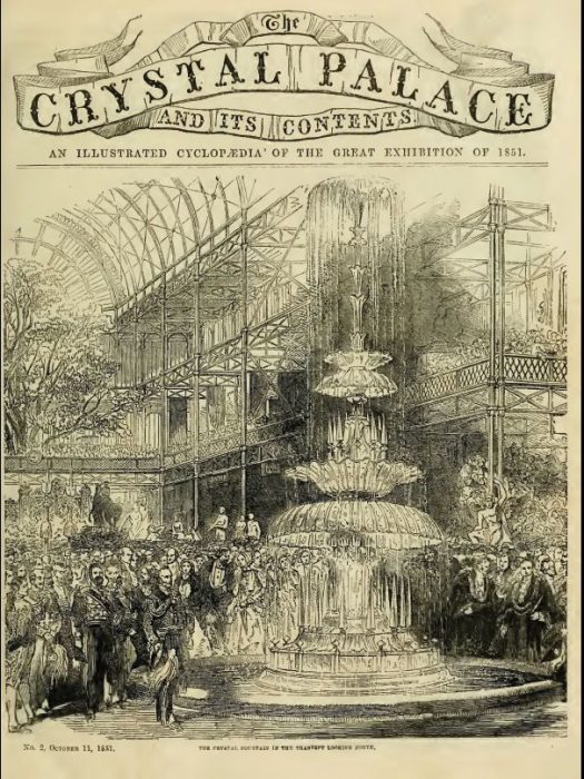
The Great Exhibition, Crystal Palace, 1851.
They are highlighted as important for the ways in which exhibitors used this platform to show craft, design, and material culture that expressed certain aspects of national identity on a public platform, as well as the ways in which the exhibitions engendered the creation of standards of design practice and institutions for design education in the mid-late nineteenth century that thoroughly shaped the last century and a half of practice in the western world–for example, the Deutsche Werkbund, the Bauhaus, the “Good Design” of midcentury modern furniture, and beyond. Singer sewing machines, Colt pistols, Otis elevators, and Robert Stevenson’s hydraulic press, among other modern design wonders, all found early mass audiences at Great Exhibitions. In more recent teaching of the Great Exhibitions, scholars have (at last, with more work still to be done) also taken great pains to unpack the many layers of colonialist thoughts and actions that shaped the presence and absence of non-white bodies and non-western cultures and countries at these “international” events.
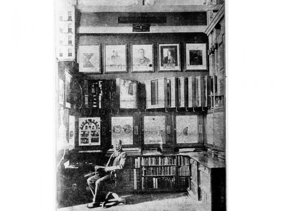
W.E.B. DuBois at the Exposition Universelle, Paris, with his data visualizations, 1900.
So, it’s safe to say that the subject of Great Exhibitions is one fairly well-traversed in design history. It was thus with some surprise that the first three design historian colleagues at whom I excitedly waved the Du Bois data visualization book had never before seen or heard of them. These are scholars whose knowledge I bow down in front of and who, between them, probably have over a century of combined teaching and publishing years between them. It thus felt like a good idea to write something short on this stellar book, and the persuasive, exciting, and thoroughly beautiful designs of Du Bois’s, so that more people devour them like I did this past month (I wrote this post back in January, and the very next day an excellent review appeared on Hyperallergic–great minds etc). And, my hope is that more teachers and curators might insert them into the classroom, into exhibitions, and into one of the canonical areas of histories–design or otherwise.
This is because Du Bois doesn’t just need to be taught in the context of Great Exhibitions. He’s part of the much longer history of data visualization that I think too often gets left by the wayside in discussions of the Industrial Revolution and emergent forms of modernity–in art and design histories, at least. I’ve helped exhibit and write about data visualization created by contemporary designers, from the excellent Wind Map devised by Fernanda Viegas and Martin Wattenburg that pulls real-time US Meteorological Center data into beautiful digital swirls, to Barrett Lyon’s visualization of the Internet, Giorgia Lupi and Stefanie Posavec’s wonderfully analog Dear Data project, and Christien Meindertsma’s book-form economy of use, PIG 05049. And don’t get me started on MIT’s doyenne of data viz, Muriel Cooper….
***
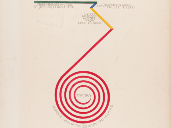
City and Rural Populations, 1890.
Employed for a while at MoMA, I saw Alfred Barr’s well-known infographic of Modern Art every time I went into the library there. When I teach, I compare his rigid flow chart with the excellent remapping of art history from the tropics by Pablo Leon de la Barra, Diagrama Tropical / Nova Cartografia Tropical from 2010. I look further back to Harry Beck’s London Underground Map (1933) and Massimo Vignelli’s NYC Subway Map (1972). And back further into the nineteenth century to examples like Dr. John Snow’s infamous cholera dot map of 1854, and Florence Nightingale’s seminal vortex-like chart, “Diagram of the Causes of Mortality in the Army in the East,” that mapped the largest cause of soldiers’ deaths (unsanitary hospital conditions, not their actual wounds) during the Crimean War. (Nightingale used the data visualization to persuade Queen Victoria and Parliament that major reform in hospital systems would have significant benefits to the mortality of their military forces, and civilians too.) And because of my own personal biases as a Scot, I go all the way back to Scotsman William Playfair who is often credited with inventing the bar graph and pie chart in 1786 and 1801, respectively, in the first and third (re)print of his Commercial Atlas which attempted to sum up British state finances.
Du Bois belongs to this history of data visualization within design. Battle-Baptiste and Rusert point to Du Bois’s “focus on modernist design … [and his] interest in representing the Black South as an integral part of modernity, a “small nation of people” who shared more in common with the broader, future-oriented “thinking world” than with an insular, backward-looking United States, where Jim Crow segregation was the rule of the land.” And of course, as well as proto-modern aesthetics, Du Bois employed Afrofuturist strategies of aspiration and reimagination around, and rewriting of, black histories long before the term was coined in the early 1990s, and became the buzzword it is today.
In fact, the closer I look, the more I can’t imagine any design history textbook printed today without these bold charts as part of the canon held within. Thanks to a chance encounter with a great book, they’re now firmly on my syllabus, that’s for sure.
Fascinatimg post. Thank you for sharing.
Fascinating post. Thank you for sharing.